【自分用メモ】少し難しい矢印デザインCSS01
こんにちは。今日は実装するのに難しかった矢印デザインについて書こうと思います。
自分用のメモで、説明も特にしないのですっ飛ばしてもらっても大丈夫です(^^;
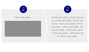
一応イメージはこんな感じです↓

ではさっそくコードのせますね。今回はsassでのせますm(_ _)m
コード
HTML編
               <div class="stepWrap">
                <div class="stepBlock -step01">
                  <div class="blockTit">
                    <div class="step">step</div>
                    <div class="num">01</div>
                  </div>
                  <div class="blockMain">
                    <div class="blockMainInner">
                      <p class="txt">テキストが入ります。</p>
                      <figure class="illust"><img src="assets/images/cont_img01.jpg" alt=""></figure>
                    </div>
                  </div>
                </div>
                <!-- ./stepBlock -->
                <div class="stepBlock -step02">
                  <div class="blockTit">
                    <div class="step">step</div>
                    <div class="num">02</div>
                  </div>
                  <div class="blockMain">
                    <div class="blockMainInner">
                      <p class="txt">テキストが入ります。テキストが入ります。テキストが入ります。テキストが入ります。テキストが入ります。テキストが入ります。テキストが入ります。テキストが入ります。テキストが入ります。テキストが入ります。テキストが入ります。テキストが入ります。</p>
                    </div>
                  </div>
                </div>
                <!-- ./stepBlock -->
              </div>
CSS編
.stepWrap
{
}
.stepBlock
{
  position: relative;
  background: #eee;
  .blockTit
  {
    display: flex;
    align-items: center;
    justify-content: center;
    flex-direction: column;
    background-color: #000080;
    border-radius: 50%;
    line-height: 1;
    color: #fff;
  }
  .blockMain
  {
    position: relative;
    overflow: hidden; //領域外の擬似要素を隠すため
  }
  .blockMainInner
  {
    position: relative;
    z-index: 1;
  }
  .txt
  {
  }
  &.-step01
  {
    .blockTit
    {
    }
    .blockMain
    {
      &:before //矢印擬似要素の基本設定
      {
        position: absolute;
        display: block;
        content: "";
        border-color: #fff;
        border-style: solid;
      }
    }
    .txt
    {
    }
    .illust
    {
      text-align: center;
    }
  }
  &.-step02
  {
    .blockTit
    {
    }
    .blockMain
    {
    }
    .txt
    {
    }
  }
}

@include mq-pc
{
  .stepWrap
  {
    display: flex;
  }
  .stepBlock
  {
    .blockTit
    {
      position: absolute;
      top: 0;
      left: 50%;

      width: 66px;
      height: 66px;

      @include fontsize(22);
      .step
      {
        @include fontsize(13);
      }
      .num
      {
        margin-top: 5px;
      }
    }
    .blockMain
    {
      box-sizing: border-box; //必要
      height: 100%; //必要
      padding: 60px 30px 40px;
    }
    .blockMainInner
    {
    }
    .txt
    {
      text-align: center;
    }
    .illust
    {
    }

    &.-step01
    {
      width: calc(50% + 30px);
      .blockTit
      {
        transform: translate(-67%,-50%);
      }
      .blockMain
      {
        &:before //矢印擬似要素
        {
          top: 50%;
          right: 0;

          width: 1000px;
          height: 1000px;
          border-width: 25px 25px 0 0;

          transform: scaleX(0.2) rotate(45deg);
          transform-origin: 100% 0; //重要
        }
      }
      .blockMainInner
      {
        padding-right: 30px;
      }
      .txt
      {
      }
      .illust
      {
        margin-top: 15px;
      }
    }
    &.-step02
    {
      flex: 1;
      .blockTit
      {
        transform: translate(-50%,-50%);
      }
      .blockMain
      {
      }
      .txt
      {
      }
    }
  }
}

@include mq-sp
{
  .stepWrap
  {
  }
  .stepBlock
  {
    .blockTit
    {
      width: 40px;
      height: 40px;

      @include fontsize(13);
      .step
      {
        @include fontsize(11);
      }
      .num
      {
        margin-top: 3px;
      }
    }
    .blockMain
    {
    }
    .txt
    {
    }
    .illust
    {
    }

    &.-step01
    {
      .blockTit
      {
        position: absolute;
        top: 0;
        left: 50%;

        transform: translate(-50%,-50%);
      }
      .blockMain
      {
        padding: 30px 20px 30px;
        &:before //矢印擬似要素
        {
          right: 50%;
          bottom: 0;

          width: 500px;
          height: 500px;
          border-width: 0 15px 15px 0;

          transform: scaleY(0.15) rotate(45deg);
          transform-origin: 100% 100%; //重要
        }
      }
      .txt
      {
      }
      .illust
      {
        margin-top: 10px;
        img
        {
          width: 88%;
          max-width: 230px;
        }
      }
    }
    &.-step02
    {
      padding: 13px 20px 25px;
      .blockTit
      {
        margin: 0 auto;
      }
      .blockMain
      {
        margin-top: 10px;
      }
      .blockMainInner
      {
      }
      .txt
      {
      }
    }
  }
}
この記事は説明はなしですm(_ _)m

コメント