【pointer-events】クリックを無効にするプロパティ
こんにちは。今日はクリックを無効にするプロパティについて忘れないように書こうと思います。
このプロパティは今日実務で初めて使ったのですが、このようにPCとSPのデザインが大きく異なる場合などに使えるよ〜ということでイメージのせますね^^
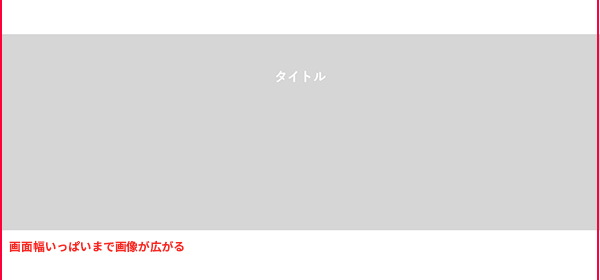
・PCデザイン
灰色部分が画像で、画面幅に応じて目一杯まで広がります。タイトルが画像の中にあるのがポイント!
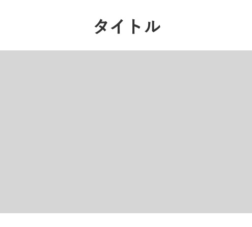
・スマホデザイン
スマホデザインではタイトルは画像の上にあります。
このためPCのとき背景画像として画像を読み込むのは出来なさそうですね・・・
デザインを見たところで、コードをさっそく見ていきましょう〜٩( ‘ω’ )و
コード
HTML編
       <section class="movieSect">
        <div class="sectInner">
          <div class="sectTit">タイトル</div>
          <a href="#">
            <div class="photoBlock">
              <picture class="photo">
                <source srcset="assets/images/cont_img01-sp.jpg" media="(max-width:768px)">
                <img src="assets/images/cont_img01.jpg" alt="">
              </picture>
            </div>
          </a>
        </div>
      </section>
CSS編
.movieSect a {
  display: block;
  text-decoration: none;
}

.movieSect .sectTit {
  text-align: center;
  font-weight: bold;
  line-height: 1;
}

.movieSect .photo img {
  width: 100%;
}

@media only screen and (min-width: 769px), print {
  .movieSect .sectInner {
    position: relative;
  }
  .movieSect .sectTit {
    position: absolute;
    top: 6vw;
    left: 50%;
    z-index: 1;
    font-size: 2.16vw;
    pointer-events: none;
    color: #fff;
    transform: translateX(-50%);
  }
}

@media only screen and (min-width: 769px) and (min-width: 769px) and (max-width: 959px) {
  .movieSect .sectTit {
    top: 5vw;
  }
}

@media only screen and (max-width: 768px) {
  .movieSect .sectTit {
    font-size: 3.4rem;
  }
  .movieSect .photoBlock {
    margin-top: 30px;
  }
}
※PCは可変対応できるようにvwにしています。
ポイントは今回のタイトルにある【pointer-events: none;】です。
PCのとき【sectTit】に記述します。
するとタイトルがクリックできなくなり、画像範囲全域がクリック領域になります。
では今日はここまで〜〜
コメント